Timeline
10 weeks (March-May 2024); development through summer 2024
Role
Designer (UI/UX, graphics)
Team
4 Designers
4 Developers
1 Project Manager
Tools
Figma
Adobe Photoshop
Adobe After Effects
Skills
Prototyping
Visual Design
Interaction Design
User Research
Project Overview
Different people can see the same image, but reach vastly different conclusions. The FINN Lab, a neuroscience lab at Dartmouth, is studying the implications of those differences in perception, and how they may inform phenomena such as mental health and politics.
In previous studies, the FINN Lab team utilized a controlled lab setting where they gathered data through pen-and-paper surveys. However, they wanted to expand their form of data collection through visitors of Dartmouth's art museum, the Hood Museum of Art. They envisioned a mobile 'edutainment' experience that allows museum-goers to enjoy an interactive digital journey, enabling them to engage directly with the artwork before them.
Our team was tasked with designing and developing a mobile app that allows Hood Museum visitors to interpret artworks through a Mad-Libs style activity.
Key Partners
Throughout the 10 week sprint, we met weekly with FINN Lab reps Professor Emily Finn and graduate student Clara Sava-Segal for reviews, standups, and feedback.
SETTING THE STAGE
Navigating partner requests
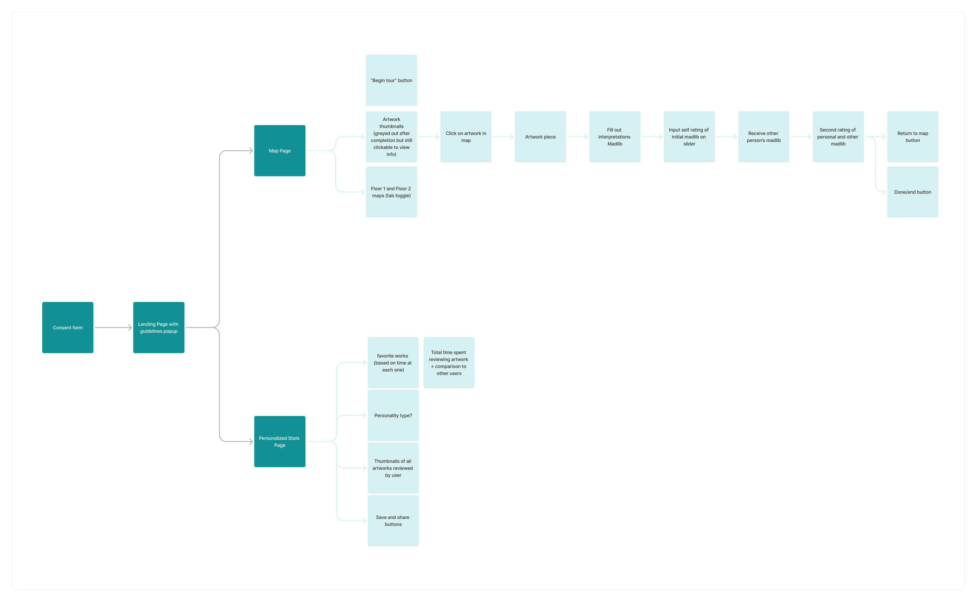
The FINN Lab partners preselected a number of paintings from the Hood Museum to be part of the study. At our first meeting, the partners presented a general user flow that would best achieve their research goals:
From the get-go, we needed to ensure we could balance an enjoyable user experience alongside the requirements and goals of a scientific study. For example, the partners needed to record quantitative data from the ratings, but not make it obvious to the users, which we needed our designs to reflect. Down the line, we would need to separate some screens and include extra instructions to ensure that participants used the app correctly.
From here, we asked ourselves:
How might we...
facilitate a research study on how people interpret art while making their museum experience enjoyable?
INDUSTRY RESEARCH
Analyzing existing apps
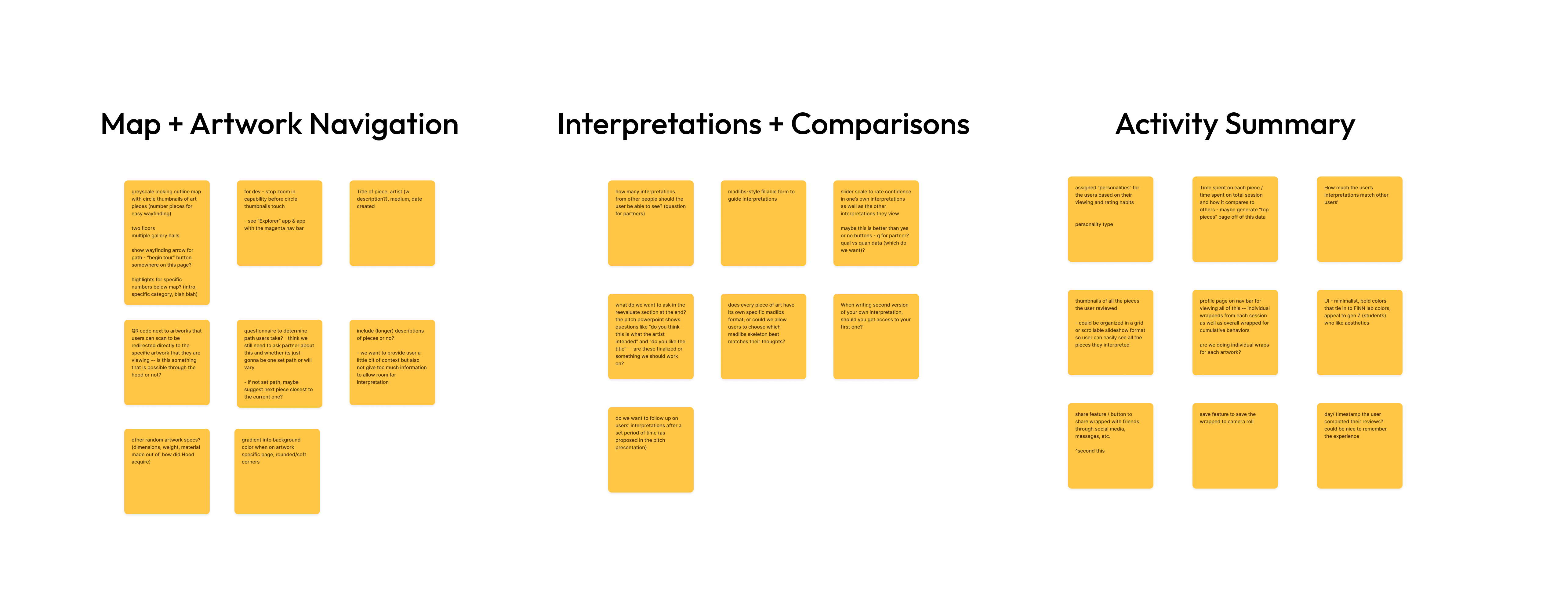
Museum apps are a unique category of technology that none of us had frequently used before. We had the broad user flow presented to us by the partners, but we also needed to see what kind of museum apps currently exist in the market. As such, we conducted research on 11 mobile and web apps related to art museum experiences, and 3 mobile apps that have activity summary features.
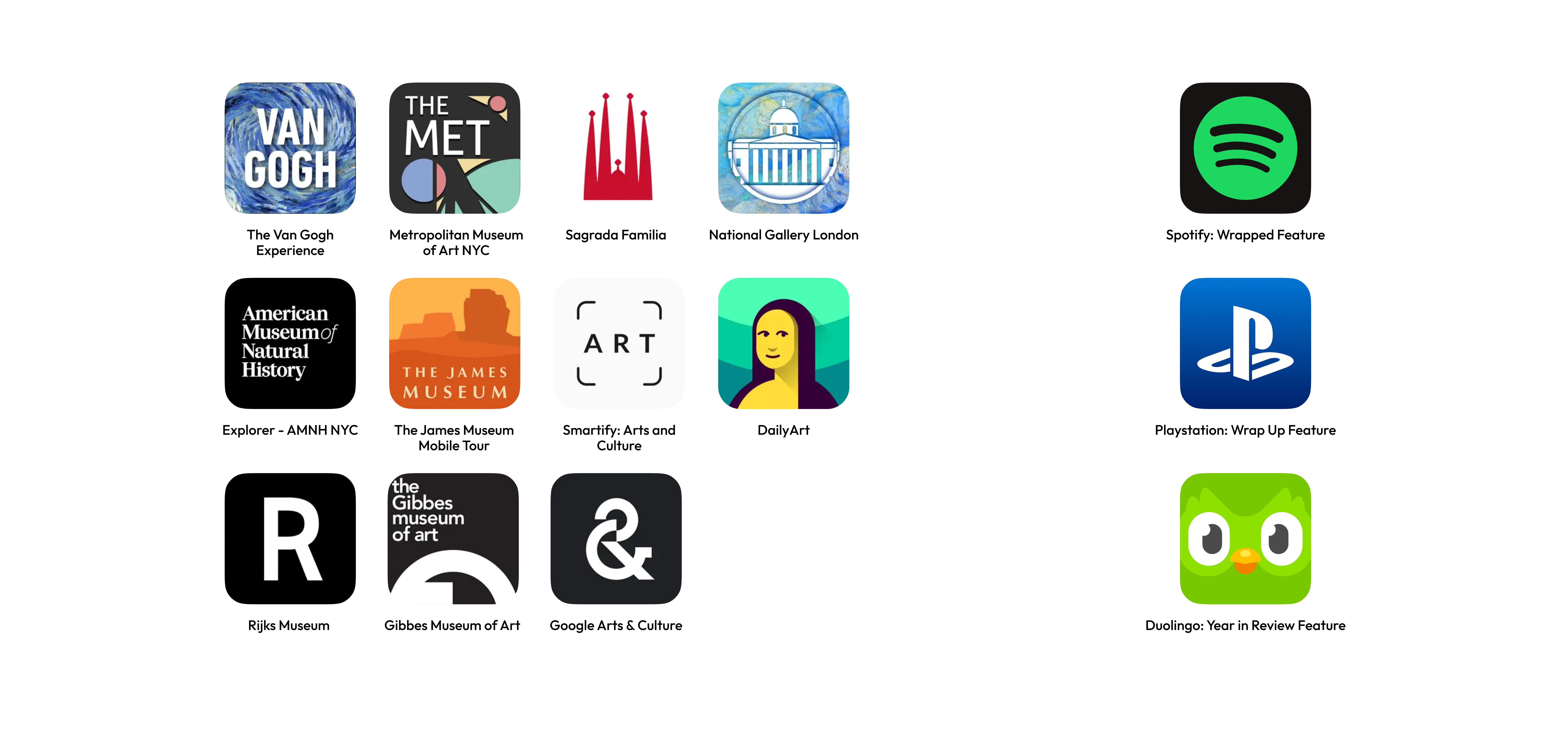
We noted down the pros and cons for each app.

After personally using some of the apps and examining their user experience, we identified three main feature buckets:
1. Museum map & navigation
2. Rating interpretations & comparisons
3. The activity summary
USER RESEARCH
User interviews
In order to understand a typical visitor's experience in the Hood Museum, we sat down with various students and faculty across Dartmouth. Each interviewee had a varying degree of interest in museums, or a background in museum art. The goal of our user interviews was to gauge the following:
What is the average visitor's experience at a museum like, and what keeps them engaged?
Because the activity displays outside opinions, what is the most user-friendly way to display them?
How do we best summarize personal data from each user's museum visit into their activity summary?
Data analysis
After our user interviews, we synthesized our findings into empathy maps. We organized our findings into what interviewees say, do, think, and feel.
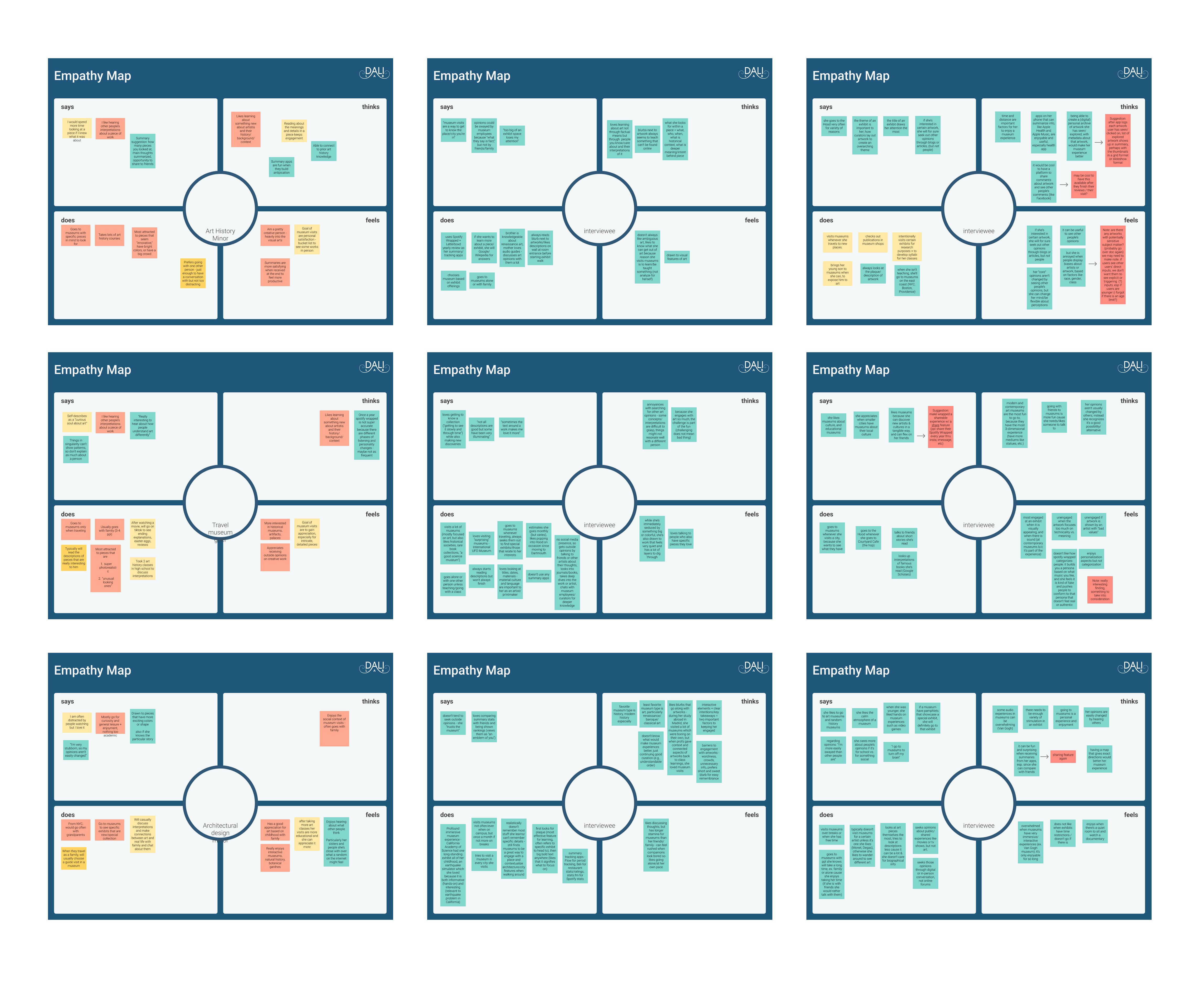
From our research, we gathered these key insights to help us with ideation:
1. Users want to know more about the art they are looking at
Many interviewees noted that they like to know the story behind the art, the artist, and the context in which the art was created. However, this brought up an issue for us: users would be prohibited from looking at the museum plaques during the study. We would need to remind them to avoid looking at those plaques while they used the app.
2. Sharing content with friends makes a user's experience more enjoyable
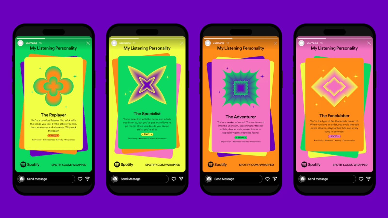
There are countless features across different social media apps, like Instagram and TikTok, where users can share content with one another. Another example is how Spotify's popular feature, Spotify Wrapped, is directly shareable from the app and postable on other media apps. Having this kind of feature could incite more people to come to the museum.
3. Users prefer to receive all summary stats at the end
When discussing apps such as Spotify or Duolingo that provide activity summaries or stats for users, interviewees said that they would be more satisfied receiving those stats at the end of a session rather than intermittently. It creates a higher anticipation for the results, and also provides a more accurate depiction when more data is presented at once, compared to some data at a time with minimal data.
IDEATION
Sketching the user flow
With our industry research and user research complete, we spent time brainstorming specific requirements and components needed for each feature bucket using a feature spec.
Following this, each designer started off with a set of rapid fire sketches (Crazy 8s) as our initial screen ideations. After our initial sketches, we refined them into solution sketches. Below are just a few of those sketches:
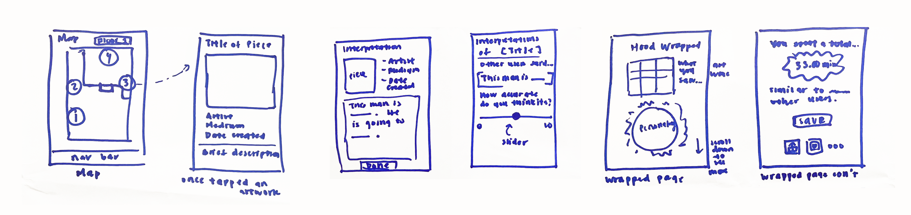
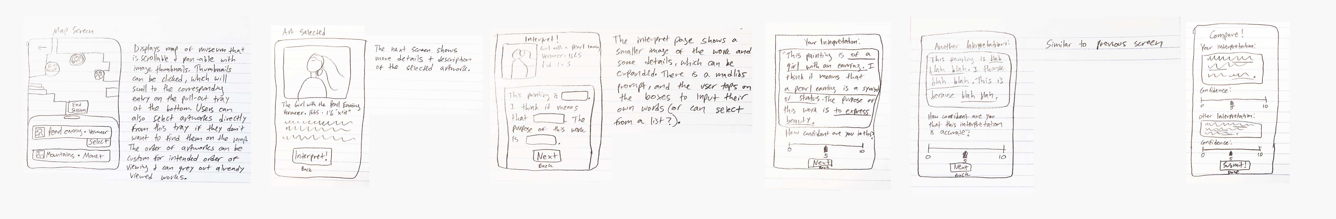
We then defined a wireflow to ensure that the layout of the screens were clear and easy to understand.
DESIGN
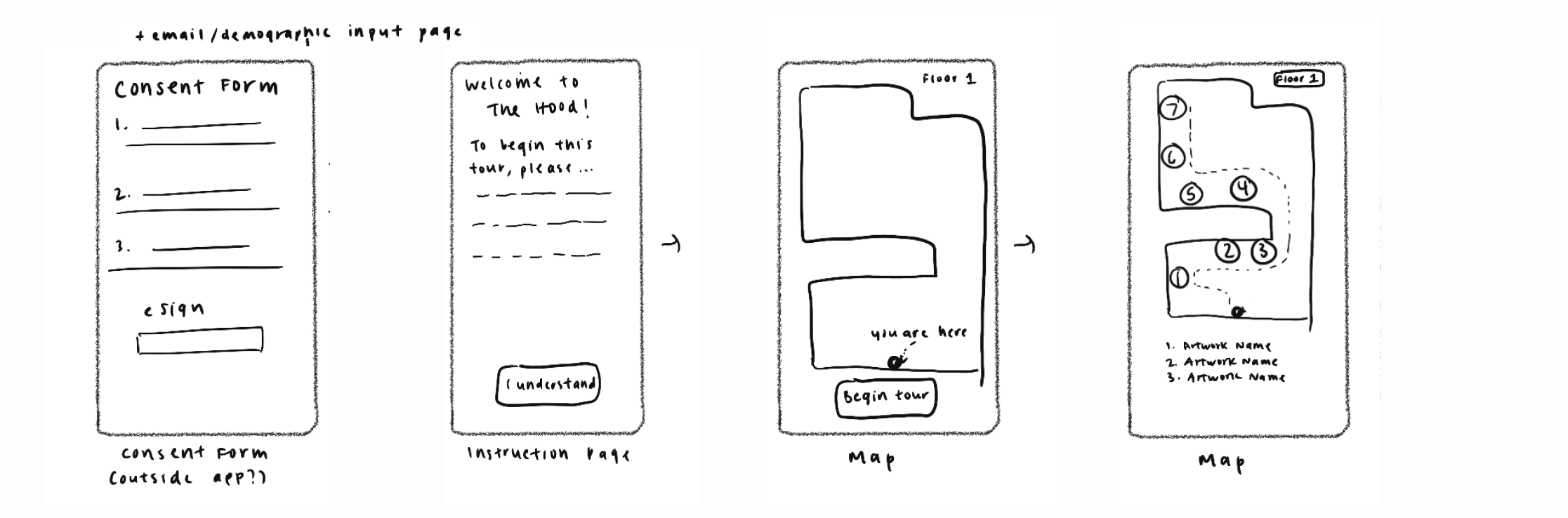
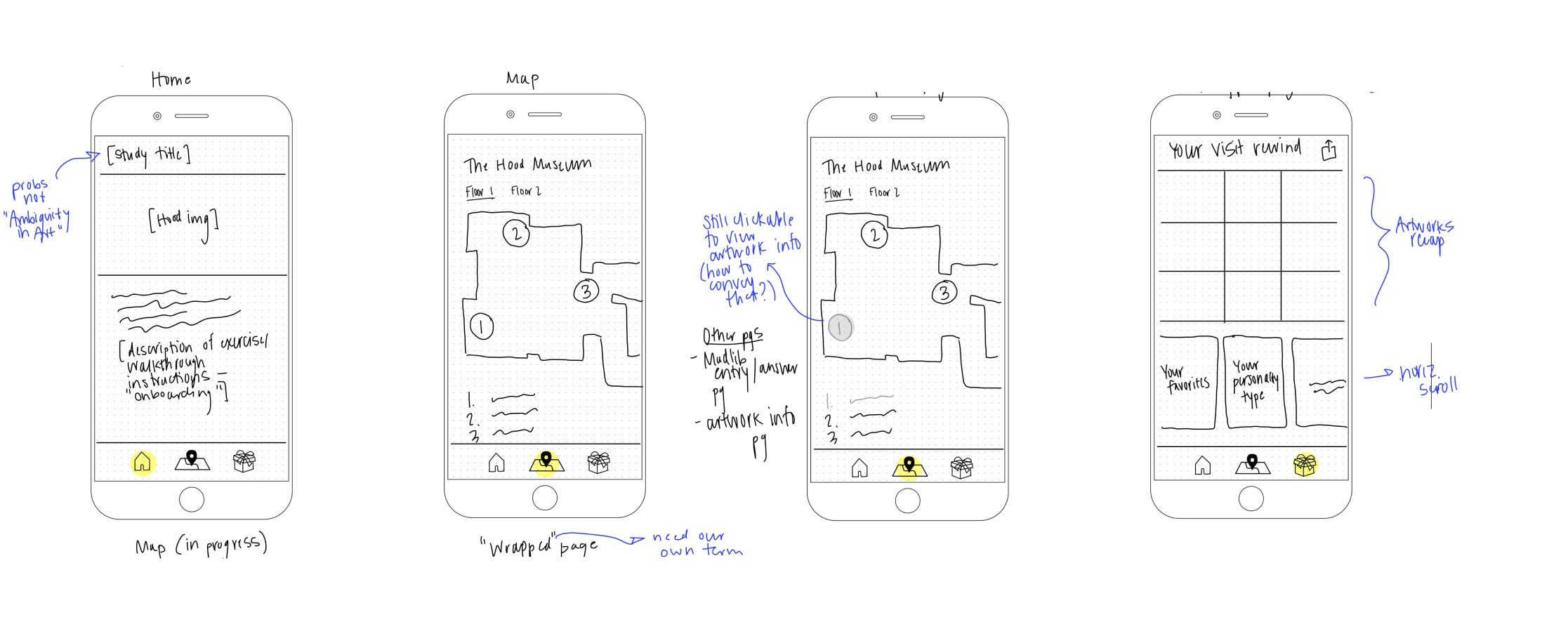
Grayscales
After defining the wireflow, each designer created our own grayscale screens. After initial iterations, we came together to discuss and noticed what we differed in our designs.
Floor toggle
There are two floors of the Hood Museum, and artworks in the study would be on both floors. We needed a feature to access each of the two floor maps. Each of us came up with different toggle components.
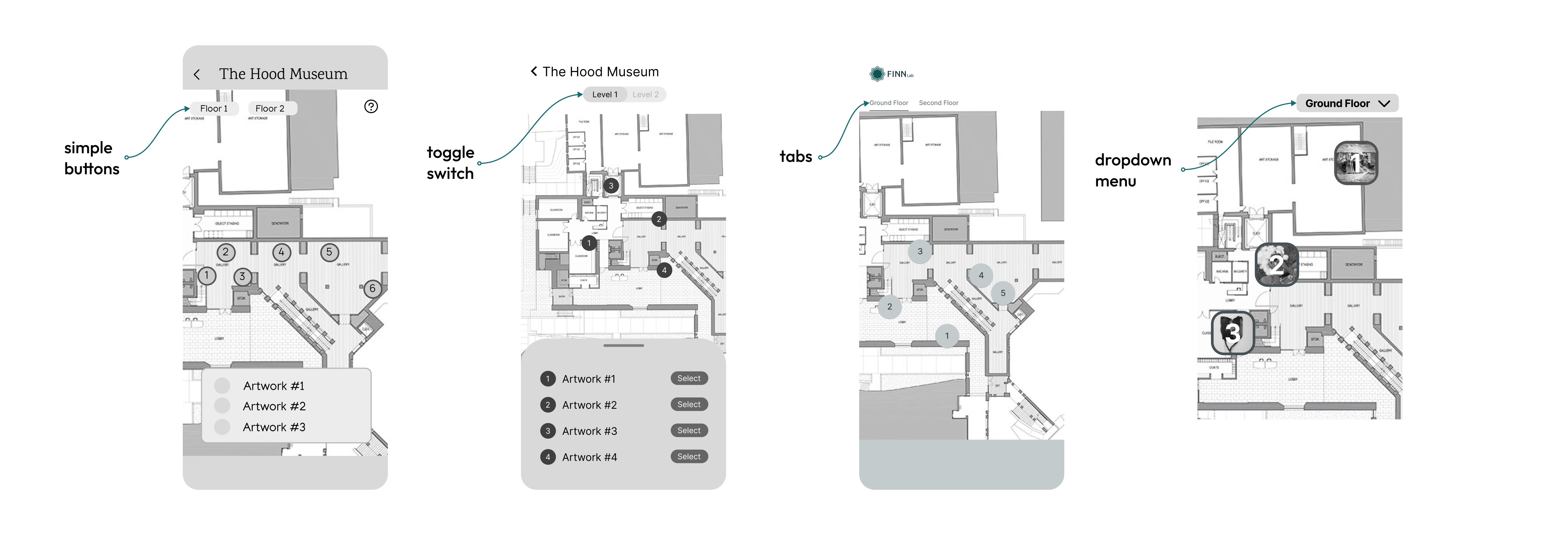
Artwork selection
The user needed to be able to select an artwork from the map to be brought to the Mad-Libs activity. We came up with four different ways in which users could select an artwork.
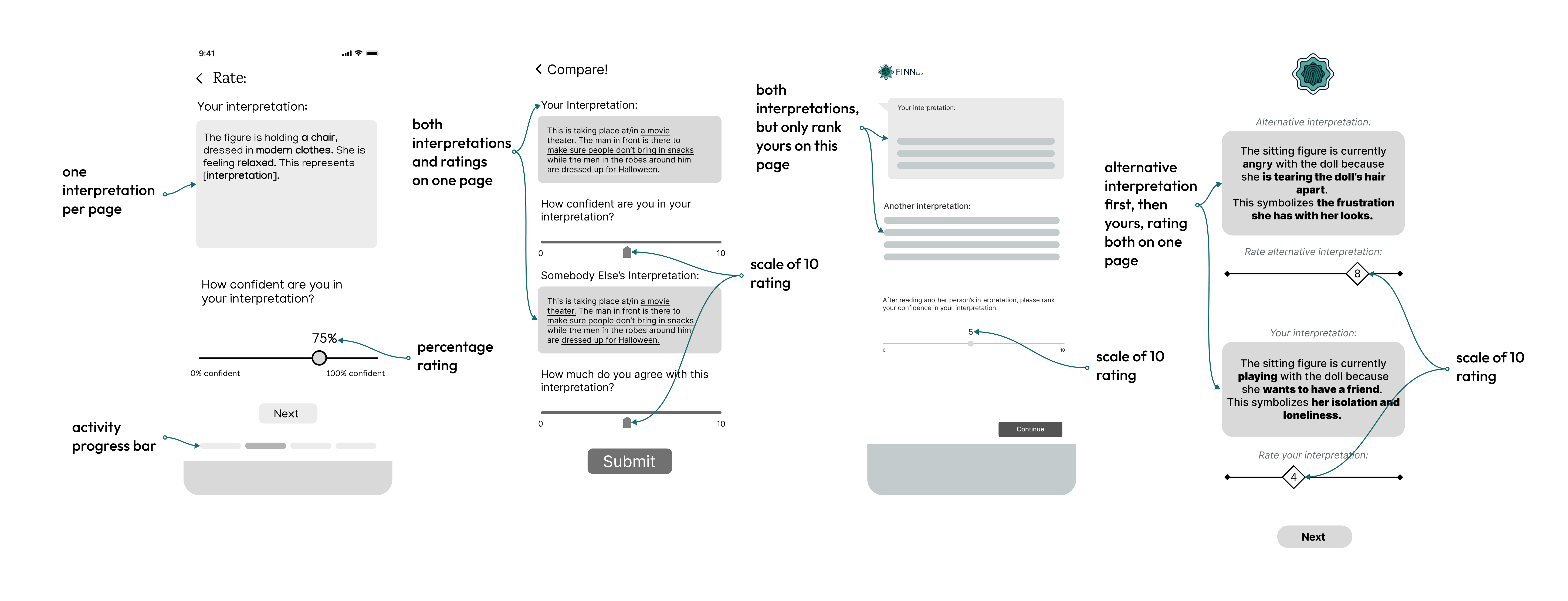
Interpretation ratings
A user had to rate their own artwork interpretations, as well as another anonymous user's interpretation. We ordered the interpretations and ratings slightly differently, which was great for comparing and contrasting.
From there, we sought user feedback in order to narrow down which features had the best usability among potential users.
PROTOTYPING
High fidelity designs
After many, many iterations, with user feedback and discussion with the partners, we landed on these final features:
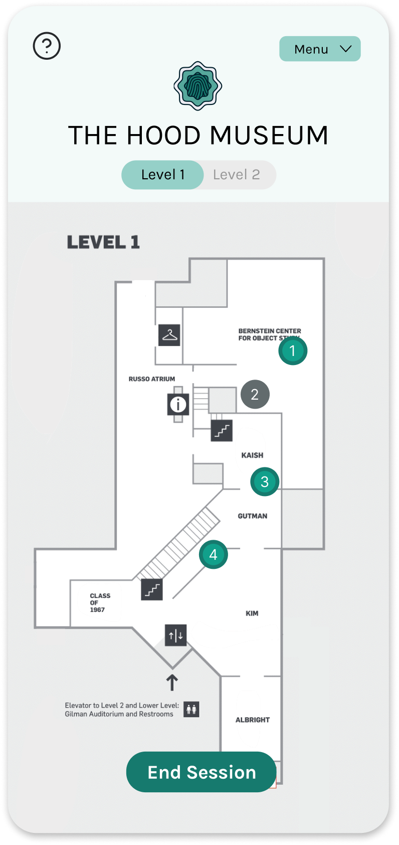
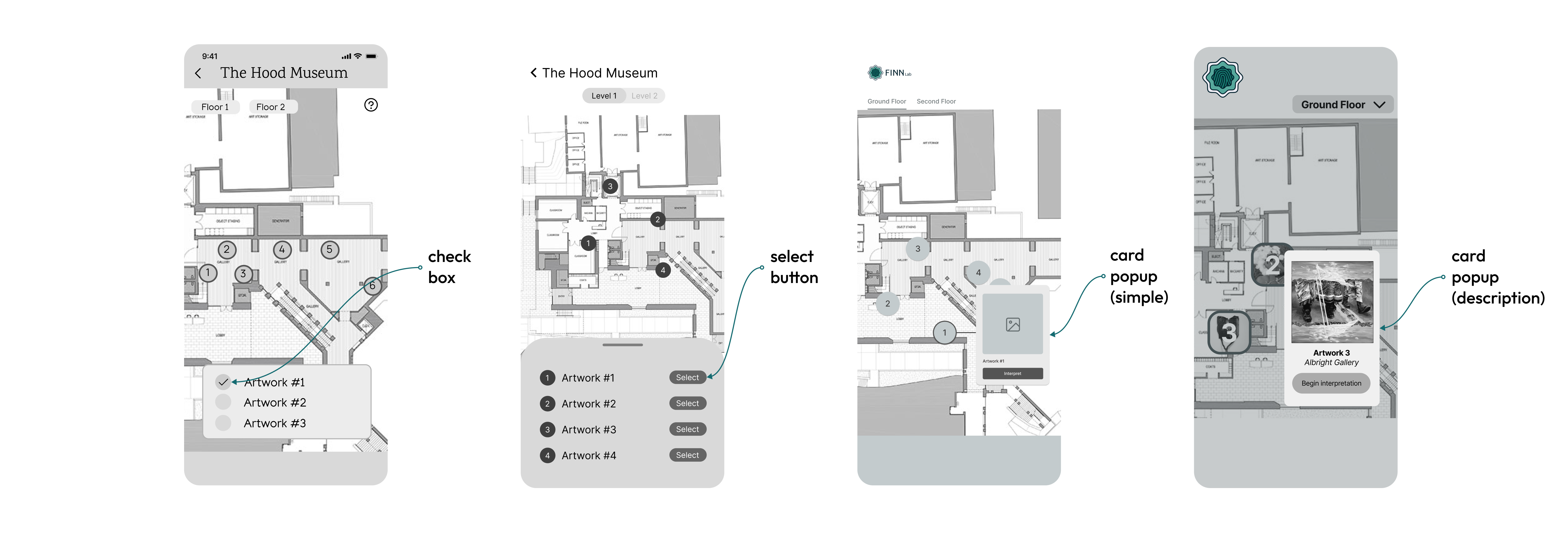
Toggle switch for floor navigation
The toggle switch was the most intuitive for users. I used Photoshop to produce cleaner, higher quality maps of the museum floors that fit the dimensions of a vertical screen.
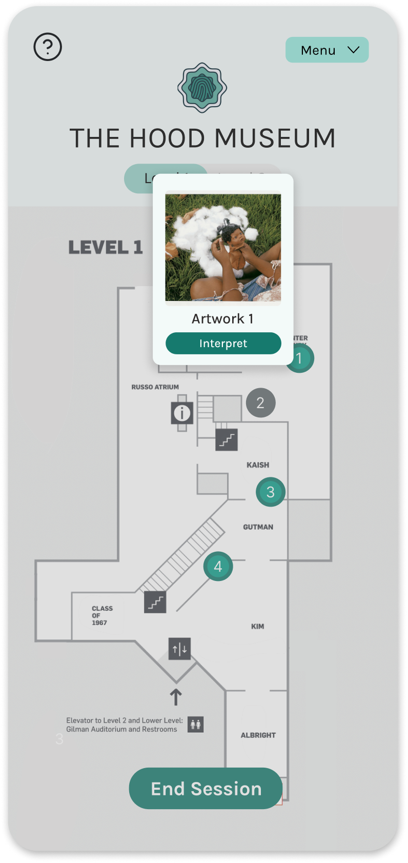
Simple artwork popup
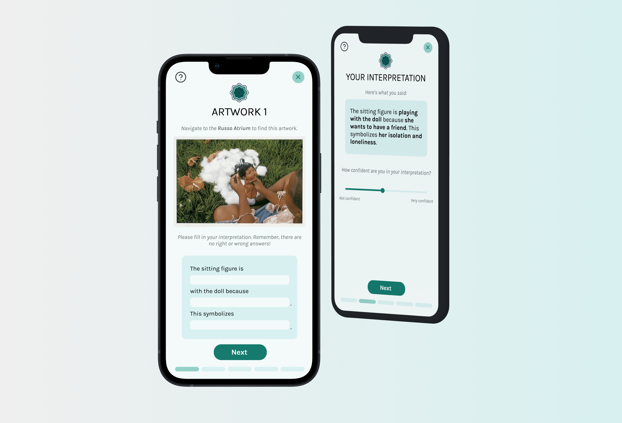
For the study's purposes, we decided to label each artwork as "Artwork [Number]" to avoid biasing user's interpretations.
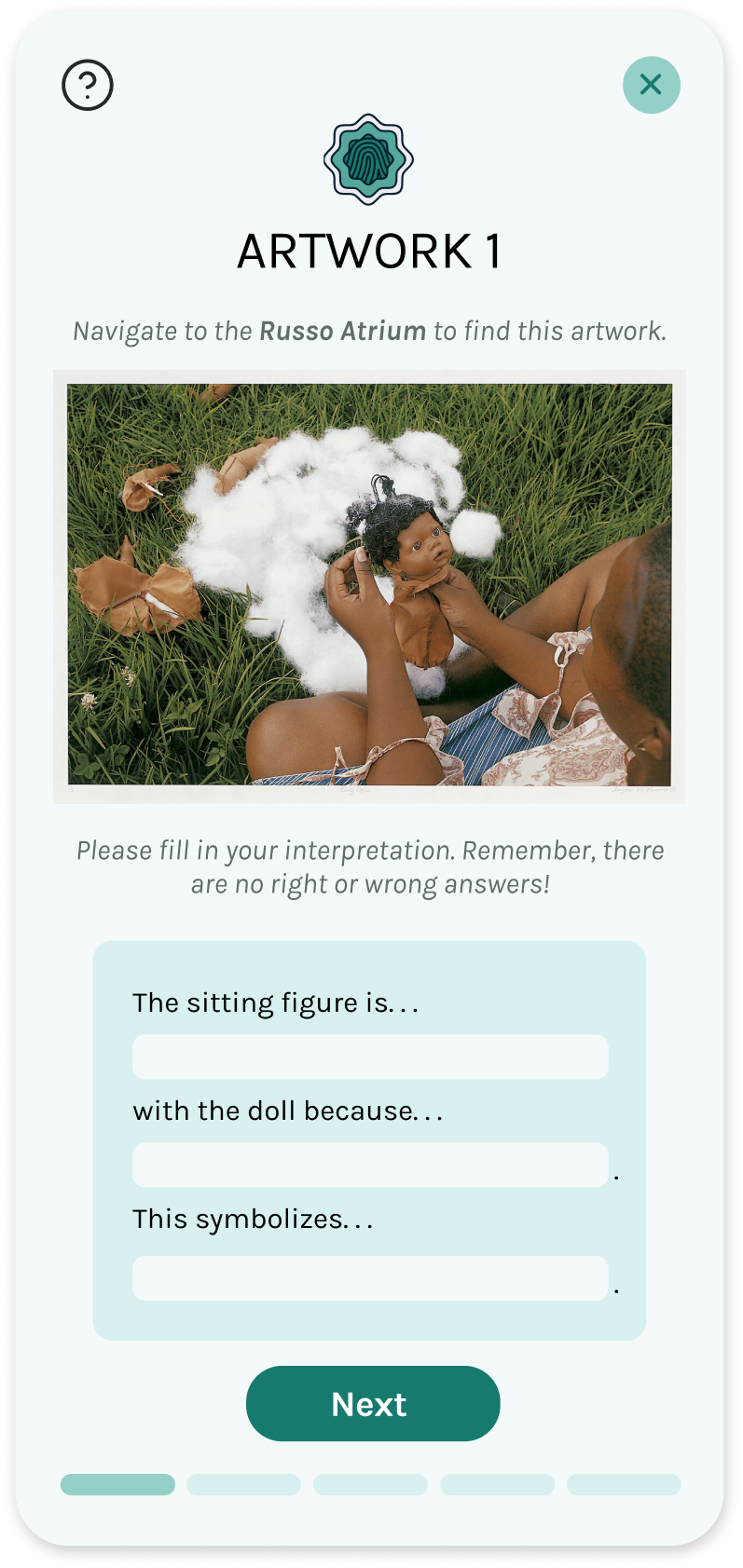
MadLibs fill-in page
We added simple directions to clarify the process for the user. I also included a progress bar on the bottom of the page, which would continue throughout each of the interpretation pages.
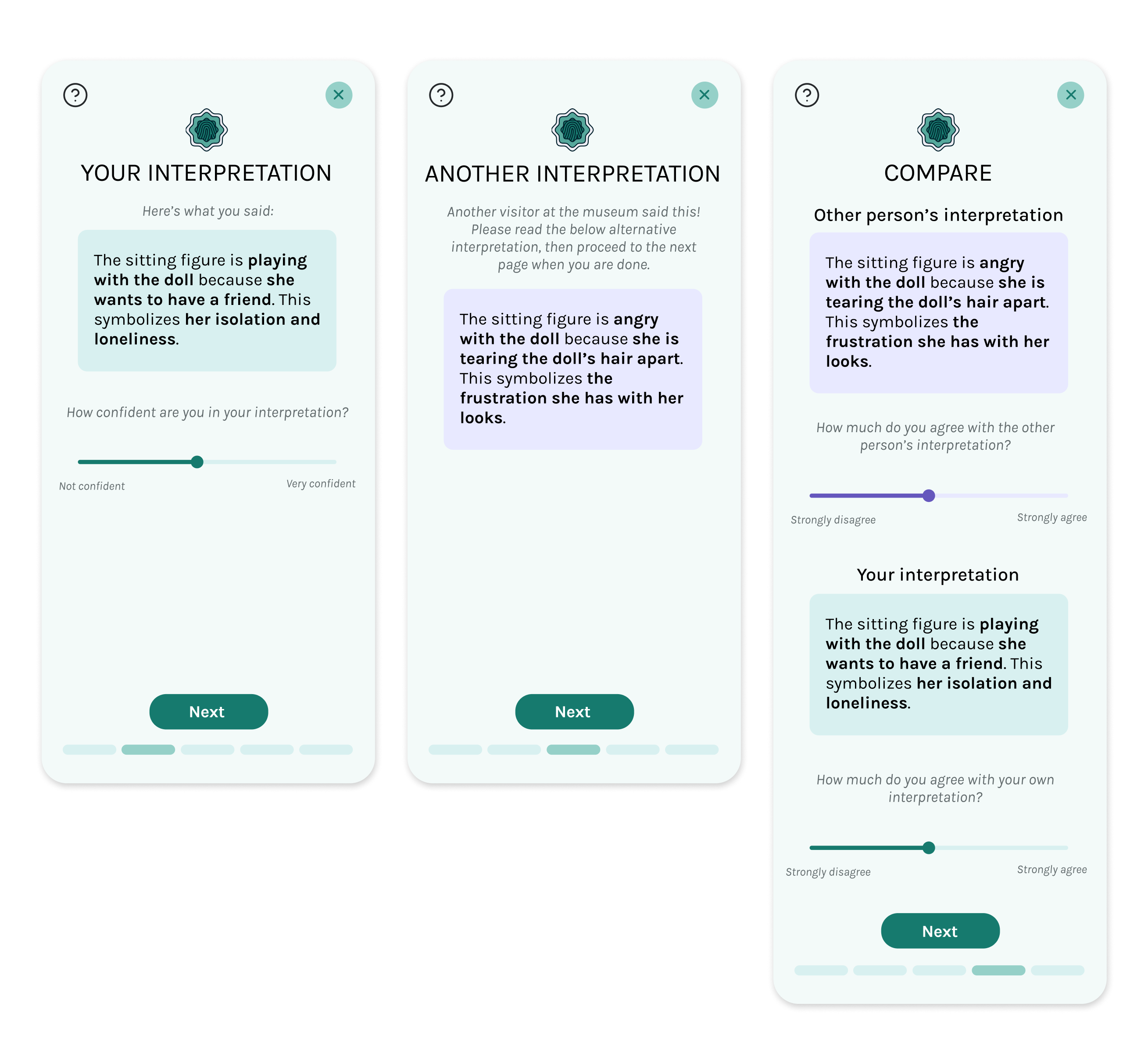
Interpretation pages
We spent the most amount of time on these pages. We eventually split up the interpretation rating stage into three screens for a few reasons. We wanted to avoid overwhelming the user with too much information at a time. Additionally, this way we could avoid users going back to change their ratings, and by asking the user to re-rate their own interpretation, we would also be able gather more data by measuring how much the user changed the rating of their own interpretation.
We also intentionally colored the user's interpretation in blue and the anonymous interpretation in purple to differentiate them. This association with color subconsciously helps users distinguish between their own and others' interpretations.
For the third interpretation screen, the order of the user's interpretations and the alternative interpretation would be randomized in development to make the ratings as accurate as possible.As a design choice, we purposely omitted back buttons in any of the activity screens, since we did not want users going back to change their initial ratings after reading an alternative interpretation, as it would interfere with data.
GRAPHICS
Creating simple animations
As part of the activity summary, we came up with the idea of presenting an "artwork personality" based on the concept of "listening personalities" from Spotify Wrapped 2022. A user's artwork personality would be based on how they rated each artwork and interpretation throughout the session, similar to how Spotify's listening personalities were based on a user's top songs and genres.
Spotify Wrapped 2022
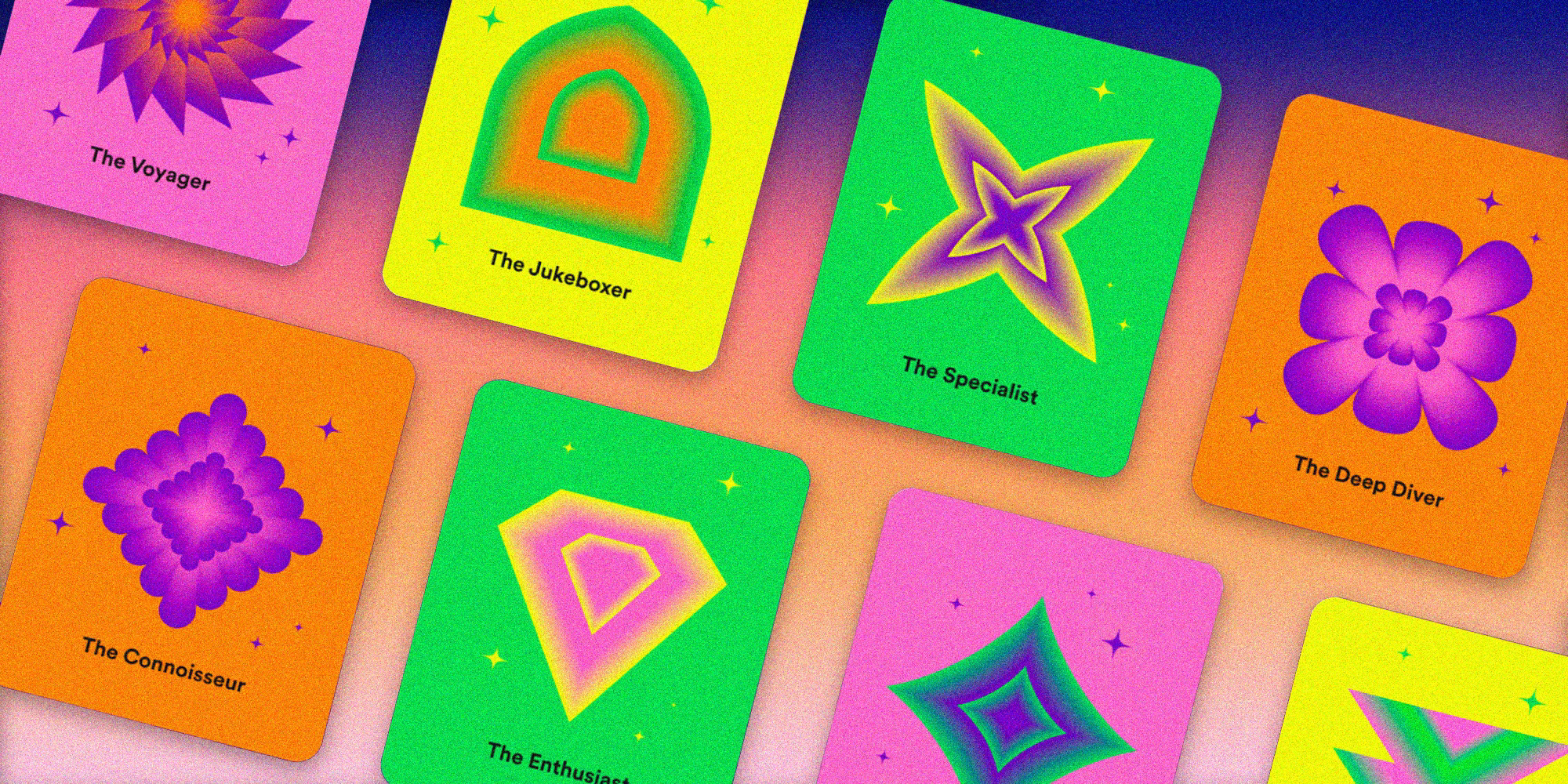
The partners wanted a total of four different artwork personalities. Initially, we had envisioned the artwork personalities as static shape images, but I wanted to take it a step further. I decided to animate them to make the personalities fun and memorable for the user. I first designed the personality shapes in Adobe Illustrator, according to their names.
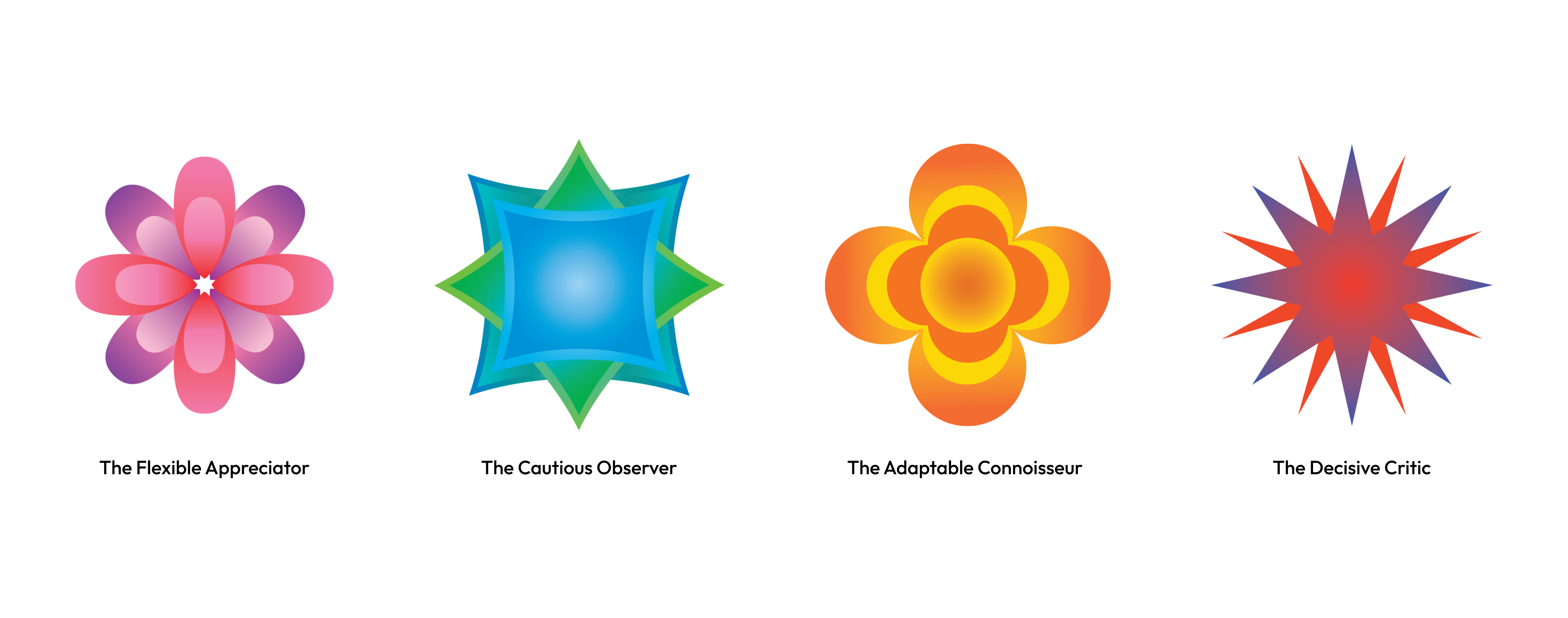
I then used Adobe After Effects to create the animations and generate animation frames, which I then rendered in Photoshop. Thus became our four artwork personalities:
FINAL PRODUCT
Bringing it all together
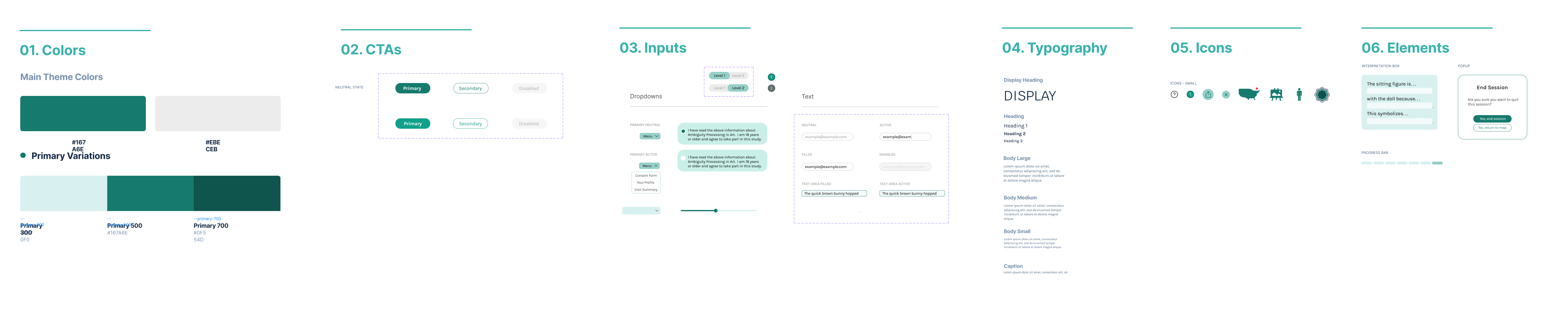
After testing with potential users and discussions with the partners, we decided on the final style guide as we prepared for handoff. We followed the color palette of the FINN Lab logo, keeping it simple and modern.
We finished our design process from beginning to end in six weeks, handing it off to our developers to complete development with the remaining 4 weeks of the term.
Final Prototype
Below is a prototype of ArtLibs where you can simulate interpreting one of the artworks in the study. By ending the session, you can view the activity summary. (Note: the consent form has been shortened for information privacy, and there is a demographic form in the prototype that is omitted here for the sake of simplicity.)
REFLECTION
Takeaways from this project
ArtLibs was my first large-scale product design project, and I am grateful to have learned so much from it and to have worked with such a wonderful team. We presented our project at Technigala, Dartmouth's quarterly tech showcase, at the end of the term.
What I learned:
Effective communication with partners: We communicated regularly with the FINN Lab partners to ensure that the project remained aligned with their goals (and they were amazing partners!). This collaboration was key in addressing any challenges promptly and integrating feedback effectively throughout our design process.
Balancing partner demands and engagement: Designing an app that simultaneously met the research needs of the FINN Lab, while also maintaining an engaging and enjoyable user experience, required a lot of iteration and feedback. The balance between collecting accurate data and providing an enjoyable user experience was crucial.
Importance of thorough research: Our extensive research on existing museum apps helped us develop key features to incorporate into the app that would align with our user’s needs. Additionally, by sitting down and interviewing potential users, I learned just how crucial thorough interviews are to clarify user needs.
Interdisciplinary collaboration: With multiple designers and developers in our team, we needed to have clear and consistent communication. Regular meetings and iterative feedback ensured that our designs were accurately translated into a polished product, and allowed us to quickly resolve any technical challenges.
Made in collaboration with the DALI Lab
What's next:
The app is currently finishing up frontend development through summer 2024.